The Dramatic Shift of the 2024 Paris Olympic Pictograms
With the Paris Olympics less then a year away it’s time to take a look at their main graphic design elements: the pictograms.
Pictograms, at the olympics, are the symbols used to represent all the different sports at the games. They are used in signage and marketing and act as a the primary iconography for a game’s system of design. Conceived for the 1964 Tokyo Olympics, pictograms originally were designed to cross language and literacy barriers. The original pictograms displayed a simplified athlete taking part in a given sport. This is typified by a side pose that combines body shape, outfits, and equipment to display the concept of a sport.

That pose based design has been used in all but two Olympic games since. When Tokyo hosted the games again in 2020… 21 they all but perfected the pose motif with outstandingly polished designs.
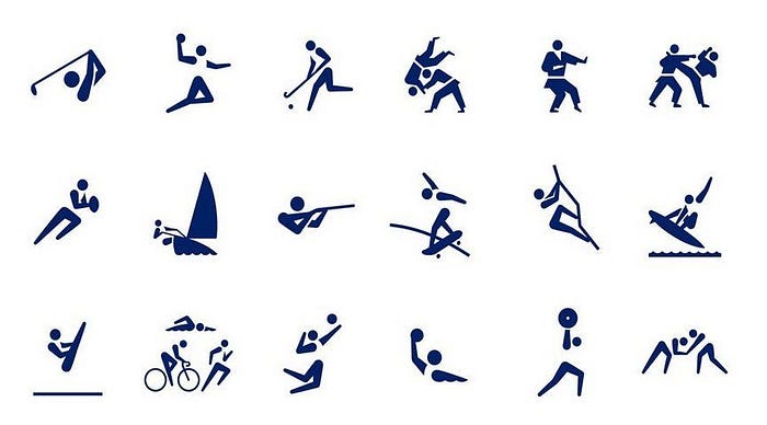
After Tokyo 1964 there was one other idea on how to represent sports graphically. Mexico City’s designers used equipment as the focal point. Instead of sloping hands and strong leg placements they went with rackets, shoes, balls, and oars.
It didn’t catch on. From Montreal to Rio, and all in between, pictograms have been poses. Although there have been artistic choices to incorporate writing styles, indigenous art, natural features, or in the 70s, metro maps, designers would only adapt the pose concept. Until Paris.
The Paris Olympic Pictograms are a dramatic departure from the iconography of the past. These designs completely stripped down and rebuilt how to symbolize sports. There’s clear inspiration from Mexico 68, only fitting that Paris 2024, like Mexico, comes after a Tokyo Olympics, but this is an entirely unique and fascinating concept. The designers call them “Coat of Arms” utilizing equipment, outfits, and venues to connect to the event. The images are merged visually through a motif of rotational symmetry. This is innovation that has never been tried before.
But are they good? It’s hard to say.
Judging by the original purpose for pictograms to represent sports without language these pictograms lack the necessary clarity. There’s more mental load required to understand what each symbol means.
But clearly recognizability was sacrificed for aesthetics. They’re not making a symbol but a “coat of arms”, a visual form about detail, storytelling, and symbolism. Let’s take a closer look at some of these pictograms from that perspective and appreciate the clever touches included in many of these designs while also singling out places where clarity becomes too overlooked.
My claim is: the more unique the sport, the more powerful the pictogram.
Athletics

We have to start our deep dive with the quintessential sport. In the past, a simple figure in the middle of a sprint has been used to capture all the complex events encapsulated in athletics. That elegance is captured in Paris’ design. The symmetry of the track sets back against shoes in the middle of pushing off the ground. Another motif used throughout the pictograms, speed streaks, runs off of the shoes to add movement. This is a strong design, but one that had the easiest job.
Breaking
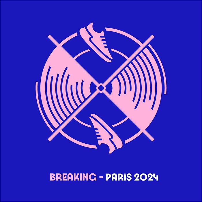
The best part of a new set of Olympic pictograms is seeing how a brand new sport is represented. Without the weight of precedent designers can use these events to fully showcase their creative vision. Breaking (break dancing) is an outstanding example of making a bold introduction. Spinning is the theme of the design, used both in the spinning records and the shoes spinning in the air. That’s a very clever connection that shows the care that went into this design. I would argue this is where the coat of arm theme thrives the most. The symmetry is directly used to portray the two roles in hip hop culture the sport taps into, b-boy/b-girl and the DJ. Both elements tell a clear visual story. It is precise, fun, and something that shows the strongest elements of this style.
Sport Climbing

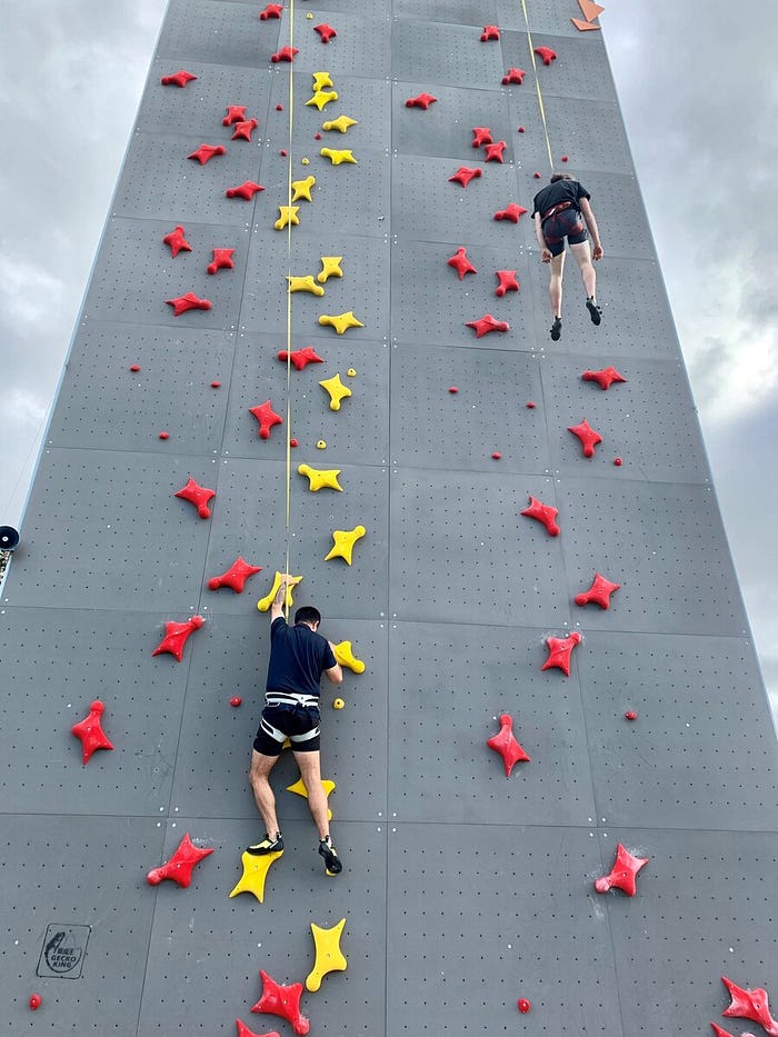
Another example that showcases how to push the coat of arms motif is sport climbing. All of the pictograms are built around symmetry, with many graphically displaying the axis of symmetry with an X in the design. This X in the weaker designs distracts from the main symbolism. (Look at the cycling events for an example) Although the X is directly drawn it to this design it doesn’t jump out, remaining hidden as the boundary of the climbing structure. An improvement the can be made across the board to these pictograms is capping off the X more often. This design is one where they did cap it off and it completely makes the pictogram work. It’s a distinct image and one that captures the unique shapes of sport climbing.
One detail I just noticed, the holds on the left and right are speed climbing holds. Speed climbing is a new event this year. The climbing structure symbol represents the other climbing event, lead and boulder (which both use angled and geometric walls)
Surfing
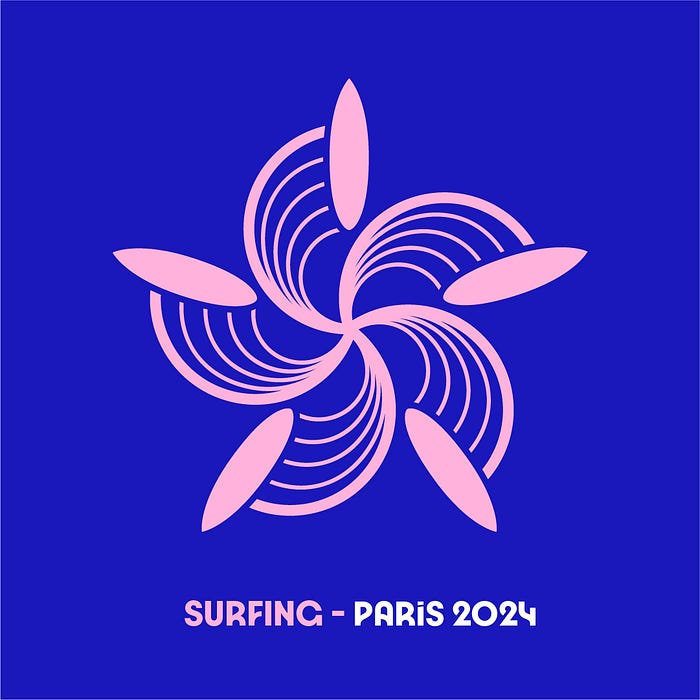
This one might be my favorite in a few ways. There’s a fundamental diversion from all the other designs that holds significant meaning. Instead of a diagonal cross with 4 quadrants; surfing is portrayed as 5 waves with a surfboard riding them in a shape resembling a flower.
You see, while the other sports at the Paris Olympics will be held in either Paris or some other part of Metropolitan France, the surfing competition will be held in the middle of the Pacific ocean at Teahupo’o, Tahiti. An event taking place on the other side of the planet is a a very unique feature that the designers have embraced.
The pictograms at an Olympics do have utility in signage, icons, communications related to a games themselves but as important is how they symbolize a games as a concept. They represent a place and time as they also represent of a sport. Through it’s uniqueness as a design the pictogram represents the uniqueness of the 2024 surfing competition. It’s a meaningful image. Elégante, or perhaps Nehenehe.
Diving
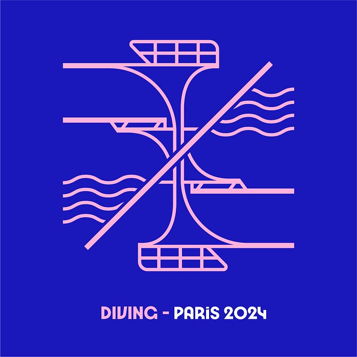
Now for some of the more muddled examples. One of the major weaknesses of this design style is the reliance on accessory symbols that aren’t as clear or as well known as a pose. Diving has one of the greatest distances between the visual strength of poses vs visual strength of equipment for the sport. Diving is dramatic and dynamic sport, one of the few sports where we can see someone striking unique and graceful poses while falling upside down 10 feet of the ground. In contrast, the equipment, the diving boards, are at best unique architectural elements. Even there the design goal of being a generalized symbol breaks down. The design of a diving platform is a bespoke creation, not a standardized part of sporting regulations. Everything beyond the height and length of the board is unique for a given diving apparatus. These pictograms are best when dynamism is portrayed. Whether through composition, shape, or cartoon speed lines. A static diving platform does not have any dynamic element.
To improve this design I would use the curvy lines that represent water as the diagonal axis between the two rotations of the diving boards. That way the relationship between air and water can be portrayed as a reflection on the water. It would still be a mostly static image, but at least it would hold more meaning.
In the image above you’ll see a different diving pictogram. That one is a top down image of waves radiating out in a pool. That image was from the orginal press release of these pictograms while the example imagaes are taken from the updated website. I can see why they changed the images, the top down perspective looks too close to an archery target, but maybe another update is needed.
Triathlon
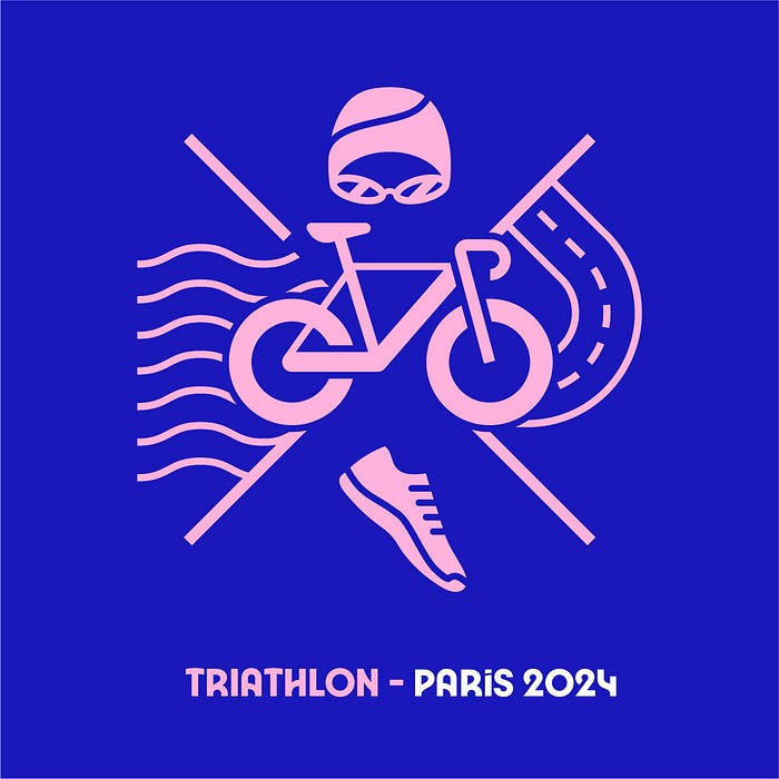
Last negative one I promise but what is going on here?
It’s almost there, the bike is just too big. Triathlon is a sport that long eludes simplicity, it’s one event with 3 different sports involved, one in water two along a road, not to mention the transition phases. They have somewhat portrayed all of that here. We have the symbols for each sport and the two terrains. Top to bottom represents the order of the sports, left to right kind of reads are the transition from water to land. The bike being the middle event makes it by default the center point in space but in composition there’s no reason it needed to be this large. To really nitpick, why is the bike in a bold? The tires are wide, the frame is wide, it’s just grabbing so much attention that it changes the balance from a sport of 3 equal sports to a bike event with some water and running. I don’t know, it just isn’t as elegant as it could be, so close.
Modern pentathlon however, that’s how you do a multi-sport event.
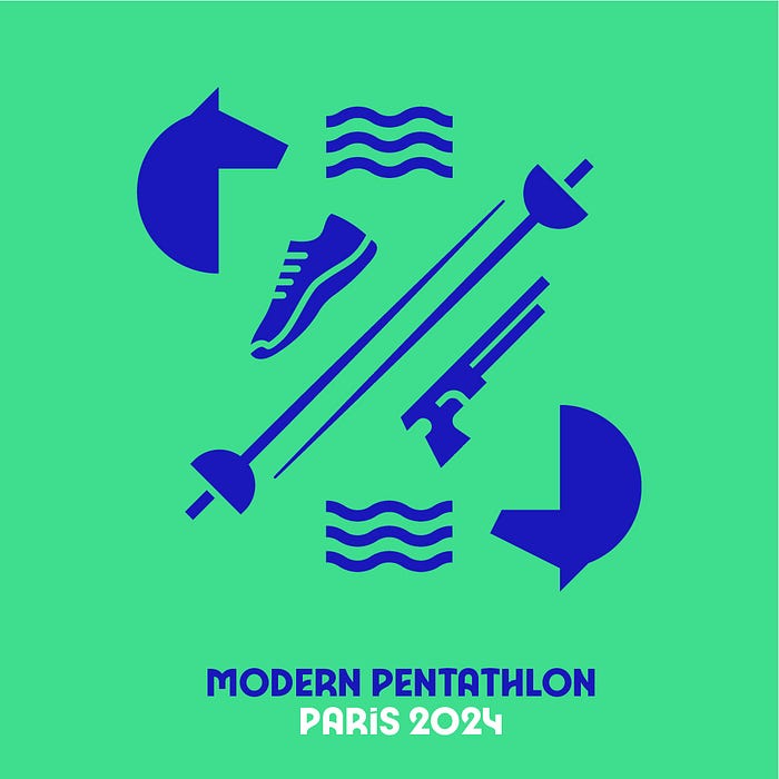
Skateboarding

Okay, one more, another recent Olympic sport. There’s a few explanations for why newer sports just work in this style. The iconography is distinct, there’s less care to distinguish from other sports because there’s no room for confusion. There’s also less precedent, only the Tokyo pictograms have tried to depict skateboarding before.
It could also be something more intrinsic to the sport. Skateboarding has only existed in the time of vector graphics. The aesthetics that were popular in the 70’s and 80’s as Skateboarding developed are the same aesthetics that the first Olympic pictograms were working in. Skateboarding, break dancing, and sport climbing all have only existed in the same graphic design era that we’re in now. The traditions and visuals built for these sports have been created with digital cameras, vector graphics, marketing, and computers in mind. Modern sports look better in pictograms because they were made to look distinct and interesting from the start.
What I find elegant about this pictogram is how the shapes on top and bottom differentiate the two events in Skateboarding, street and park. Other sports don’t contain all the necessary meaning, or don’t do it this cleanly.
Conclusion
Are these good?
That really is the question.
Let’s do what any good Olympic judge tries to do and quantify some qualitative concepts: We’ll do a final ranking of the whole set in a few categories: Legibility, Design, Meaning.
Legibility, how easy they are to read and map to their sport, it’s a 2 out of 5. The new equipment lexicon makes it more muddled, harder to parse, a relearning experience compared to the poses. There’s an argument that the weight of legibility is lower today. In a digital era wayfinding and communication come in many different forms and don’t require graphics. You’re rarely going to see these pictograms isolated from a translated label or spoken phrase. All sports are still distinctly represented, but without prior knowledge seeing those distinctions can feel like playing a trvia game.
Design, how good the pictograms look as a whole concept, I’ll give it a 3.5 out of 5. Many are really well made images that take the design template and push it in creative ways. The one’s highlighted above are pleasing and interesting images. At the same time some sports just don’t fit or fit in too well to be noticeable. The biggest hit are the newer cycling events. The symmetry is an after thought, bikes are just slapped in the middle of each design. Compared to the road and track images there’s really no excuse. The team ball sports also just blend together. Most of the pictograms pass, but the ones that lack cohesion bring down the whole set.
Meaning, how much information they display, I’ll give a 4. The equipment and venues allow for adding details where needed. Skateboarding, surfing, sport climbing, all of these pictograms show more, have more meaning, then their Tokyo counterparts. Breaking as well is a rich image, filled with meaning. Those are the strongest designs in terms of meaning, which is why they are the ones highlighted, but I recommend scanning through these designs and trying to pickup on details. Equestrian has a great method of showcasing each type of event. Gymnastics is able to fit every apparatus in one image. Each sport that needs a ball has their own version. Is it less elegant then Tokyo, yes (previous pictograms didn’t need to have a different design for each ball, a filled in circle was enough) but the extra details give a playful spirit to these designs that I can appreciate.
In short, they do somewhat fail as utilities, and are passable as designs, but they take an extra step in representing all of the Olympic sports and that should be noted, perhaps celebrated.
Paris 2024 tried something new, they are trying a lot of things new for an Olympics: A parade like opening ceremony on the Siene, building a minimum amount of new venues. It’s been exactly a century since they last hosted the games and they can’t be blamed for wanting to show how far the city of Paris and the Olympics have gone in those last 100 years.
I say good luck, allons-y.
